# 6. 盒模型
本章主要介绍元素盒模型的css属性
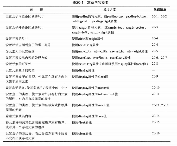
# padding和margin
# 内边距 padding
- padding-top 内容和顶部边框距离
- padding-right 内容和右边边框距离
- padding-bottom 内容和底部边框距离
- padding-left 内容和左边边框距离
- padding 简写
- 4参数:padding: [padding-top] [padding-right] [padding-bottom] [padding-left]
- 3参数:padding: [padding-top] [padding-left和padding-right] [padding-bottom]
- 2参数:padding: [padding-top和padding-bottom] [padding-left和padding-right];
# 外边距 margin
- margin-top
- margin-right
- margin-bottom
- margin-left
- margin 简写,与padding类似
# 控制元素的尺寸
尺寸相关的属性:
- width,height 元素宽度和高度, 默认auto,百分比是根据包含块的宽度或高度来决定。
- min-width, min-height 元素最小可接受宽度和高度,默认auto
- max-width, max-height 元素最大可接受宽度和高度,默认auto
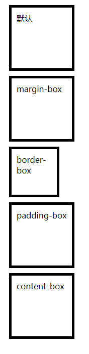
- box-sizing 设置尺寸调整应用到元素盒子的哪一部分
- content-box 默认
- padding-box
- border-box (border + padding + content) = width
- margin-box
- inherit 继承父元素的该属性
# box-sizing
  <head>
    <meta charset="utf-8">
    <title>盒模型</title>
    <style>
      div {
        width: 100px;
        height: 100px;
        border: 5px solid black;
        margin: 10px;
        padding: 10px;
      }
      #div2 {
        box-sizing: margin-box;
      }
      #div3 {
        box-sizing: border-box; /* border + padding + content = width */
      }
      #div4 {
        box-sizing: padding-box;
      }
      #div5 {
        box-sizing: content-box; /* 默认值 */
      }
    </style>
  </head>
  <body>
    <div id="div1">默认</div>
    <div id="div2">margin-box</div>
    <div id="div3">border-box</div>
    <div id="div4">padding-box</div>
    <div id="div5">content-box</div>
  </body>
# 设置最小和最大尺寸
div {
  width: 50%;
  min-width: 400px;
  max-width: 600px;
  border: thin solid black;
}
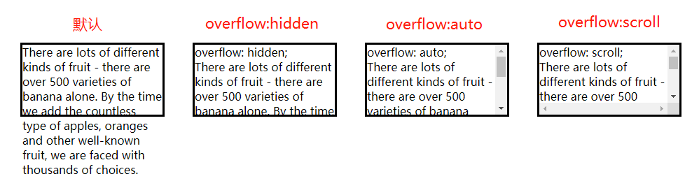
# overflow 处理溢出内容
如果内容太大,无法显示在元素的内容盒中。
- overflow-x,overflow-y 设置水平方向和垂直方向的溢出方式
- overflow 简写属性 overflow-x overflow-y
溢出属性的值:
- auto 浏览器自行处理
- hidden 多余的部分直接剪掉,剪掉的内容用户看不到
- scroll 添加滚动条
- visible 默认值,不管是否溢出,都显示元素内容
  <head>
    <meta charset="utf-8">
    <title>边框和背景</title>
    <style>
      body {
        display: flex;
        padding: 100px;
      }
      p {
        height: 100px;
        width: 200px;
        margin: 20px;
        border: medium solid black;
      }
      #p2 {
        overflow: hidden;
      }
      #p3 {
        overflow: auto;
      }
      #p4 {
        overflow: scroll;
      }
    </style>
  </head>
  <body>
    <p>
      There are lots of different kinds of fruit - there are over 500 varieties
      of banana alone. By the time we add the countless type of apples, oranges
      and other well-known fruit, we are faced with thousands of choices.
    </p>
    <p id="p2">
      overflow: hidden;<br>
      There are lots of different kinds of fruit - there are over 500 varieties
      of banana alone. By the time we add the countless type of apples, oranges
      and other well-known fruit, we are faced with thousands of choices.
    </p>
    <p id="p3">
      overflow: auto;<br>
      There are lots of different kinds of fruit - there are over 500 varieties
      of banana alone. By the time we add the countless type of apples, oranges
      and other well-known fruit, we are faced with thousands of choices.
    </p>
    <p id="p4">
      overflow: scroll;<br>
      There are lots of different kinds of fruit - there are over 500 varieties
      of banana alone. By the time we add the countless type of apples, oranges
      and other well-known fruit, we are faced with thousands of choices.
    </p>
  </body>
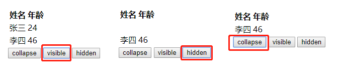
# visibility 控制元素的可见性
visibility 设置元素的可见性。
- cllapse 元素不可见,且页面布局中不占据空间,一般是表格元素才支持,p元素不支持。可用display:none替代
- hidden 元素不可见,但在页面布局中占据空间
- visible 默认值,元素在页面上可见
  <body>
    <table>
      <tr>
        <th>姓名</th>
        <th>年龄</th>
      </tr>
      <tr id="p2">
        <td>张三</td> <td>24</td>
      </tr>
      <tr>
        <td>李四</td> <td>46</td>
      </tr>
    </table>
    <div>
      <button>collapse</button>
      <button>visible</button>
      <button>hidden</button>
    </div>
    <script>
      var btns = document.getElementsByTagName('button'),
          p2 = document.getElementById('p2'),
          len = btns.length,
          i;

      for (i = 0; i < len; i++) {
        btns[i].onclick = function(e) {
          p2.style.visibility = e.target.innerHTML;
        }
      }
    </script>
  </body>
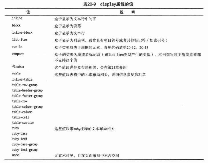
# display 设置元素盒模型
display属性提供了一种改变元素盒类型的方式,会改变元素在页面上的布局方式。
# display:block 块级元素
块级元素会自动换行,默认宽度为100%,比如元素p,div等
# display:inline 行内元素
行内元素不会换行,且设置width,height,margin-top,margin-bottom均无效果,如span, a, b等元素。书中所说,margin会无效,但Chrome里设置是有效的,float也是有效的。
# display:inlline-block 行内-块级元素
可以将元素设置为行内-块级元素,这样元素不会换行显示,还是在一行里,但可以设置width、height等属性。
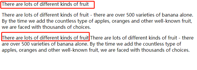
# display:run-in 插入元素
如果display设置为run-in,元素盒子的类型取决于周围的元素
- 1.如果相邻元素为块级元素,则该元素为块级元素
- 2.如果相邻的兄弟元素为行内元素,则该元素为行内元素
- 3.其他情况,该元素均为块级元素
  <head>
    <meta charset="utf-8">
    <title>边框和背景</title>
    <style>
      span { display: run-in;}
      section p {
        display: inline;
      }
    </style>
  </head>
  <body>
    <span>
        There are lots of different kinds of fruit
    </span>
    <p>
      There are lots of different kinds of fruit - there are over 500 varieties
      of banana alone. By the time we add the countless type of apples, oranges
      and other well-known fruit, we are faced with thousands of choices.
    </p>

    <section>
        <span>
            There are lots of different kinds of fruit
        </span>
        <p>
          There are lots of different kinds of fruit - there are over 500 varieties
          of banana alone. By the time we add the countless type of apples, oranges
          and other well-known fruit, we are faced with thousands of choices.
        </p>
    </section>
  </body>
# display:none 隐藏元素
display为none则不显示,不占据任何空间
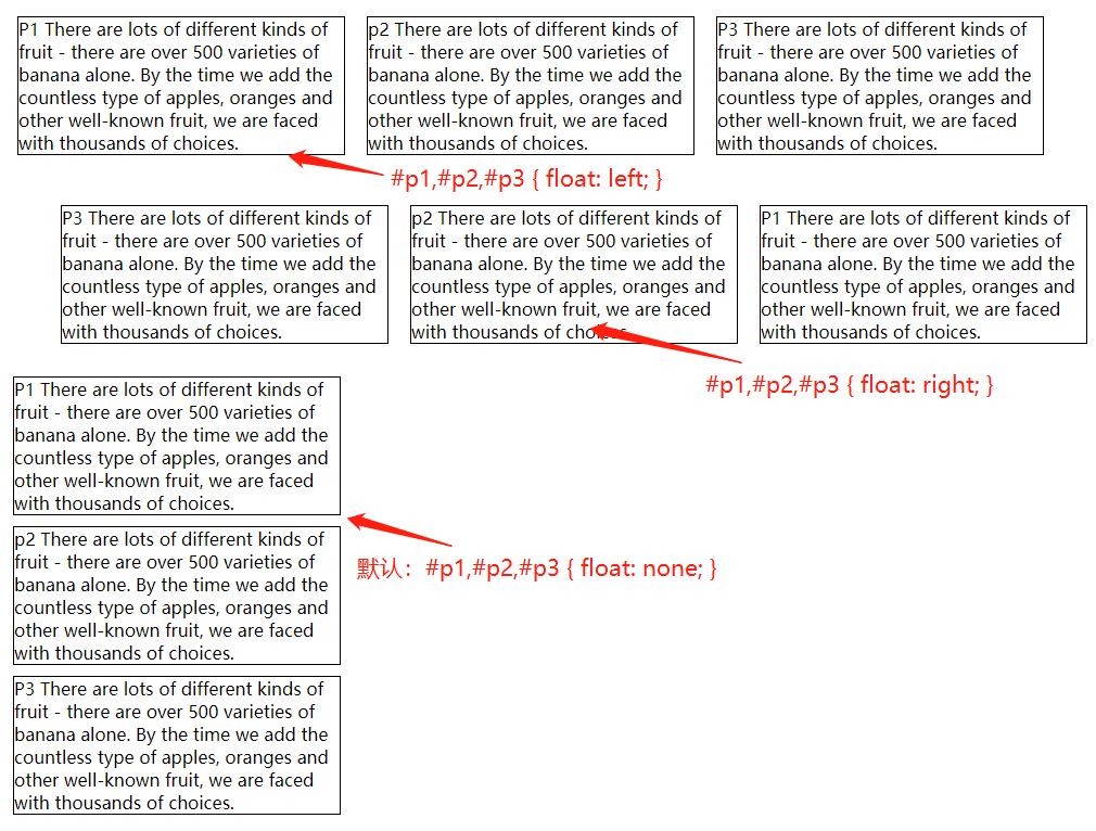
# float 创建浮动盒
可以使用float属性创建浮动盒,浮动盒会将元素的左边界(float:left)或右边界(float:right)移动到包含块或另一个浮动盒的边界, js设置时使用element.style.cssFloat
float 设置浮动的样式
- left 移动元素,使其左边界挨着包含块的左边界,或另一个浮动元素的右边界
- right 移动元素,使其右边界挨着包含块的右边界,或另一个浮动元素的左边界
- none 元素位置固定 (默认值)
  <head>
    <meta charset="utf-8">
    <title>边框和背景</title>
    <style>
      p {
        width: 300px;
        border: thin solid black;
        margin:10px;
      }
      /* #p1, #p2, #p3 {
        float: left;
      } */
      /* #p1, #p2, #p3 {
        float: right;
      } */
    </style>
  </head>
  <body>
    <p id="p1">
      P1 There are lots of different kinds of fruit - there are over 500 varieties
      of banana alone. <span>By the time we add the countless</span> type of apples, oranges
      and other well-known fruit, we are faced with thousands of choices.
    </p>
    <p id="p2">
      p2 There are lots of different kinds of fruit - there are over 500 varieties
      of banana alone. <span>By the time we add the countless</span> type of apples, oranges
      and other well-known fruit, we are faced with thousands of choices.
    </p>
    <p id="p3">
      P3 There are lots of different kinds of fruit - there are over 500 varieties
      of banana alone. <span>By the time we add the countless</span> type of apples, oranges
      and other well-known fruit, we are faced with thousands of choices.
    </p>
  </body>
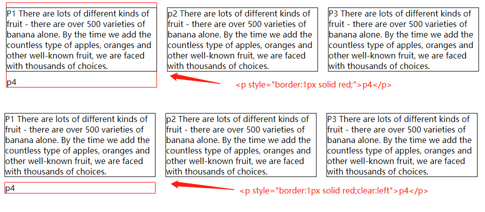
# clear阻止浮动元素堆叠
clear 设置元素的左边界、右边界、或左右两边都不允许出现浮动元素
- left 元素的左边边距,不能挨着浮动元素
- right 元素的右边边距,不能挨着浮动元素
- both 元素的左右边距都不能挨着浮动元素
- none 默认,元素的两边都可以右浮动元素怒
上面的例子中,如果新增加一个p4,由于前三个元素都float:left,p4会和p1显示在一起。
<p style="border:1px solid red;">
  p4
</p>
需要清除浮动,p4才能按照正常布局显示,clear:left或clear:both;
<p style="border:1px solid red;clear:left">
  p4
</p>